Humphrey Jennings

Humphrey Jennings
Humphrey Jennings

A new exhibition at South Wales based Ffotogallery looks at the work of Humphrey Jennings, the English documentary film maker during the 1940s. The exhibition focuses on his 1943 propaganda film The Silent Village, set in Wales but based on Nazi atrocities in Czechoslovakia.

Humphrey Jennings has often been edited out of analytical cinematic theory, yet his influence should be appreciated as a critical figure in British war-time film making. He was called not only a film maker, but “a poet, a painter, an intellectual and an anthropologist”.

After graduating from Cambridge University with a double First in English, Jennings worked as a painter, photographer and theatre designer. In 1940 he joined the GPO Film Unit, which became the propaganda film branch of the Ministry for Information. Jennings’ films may remain in shadows of appreciation, but their importance to British cinema are paramount. Listen to Britain is often regarded as one of the best British films ever made. However, The Silent Village is perhaps one of his most powerful works.

In the Czechoslovakian mining village of Lidice, on June 10th 1942, 340 villagers were murdered by the Nazis. It was a shocking massacre of human life, either by firing range or suffering the horrors of the gas chambers. The barbaric act sent waves of anger and sympathy across the western world. Just days after Lidice, the Ministry of Information and Jennings set to work on a propaganda film based on the events, only set in the South Wales mining village of Cwmgiedd near Ystradgynlais. Using real villagers of the South Wales community, the miners felt a strong connection to their Czech counterparts.

The drama-documentary film is almost underplayed. Jennings does not use violence or action, which makes it all the more effective. We are shown Nazis taking control of the Welsh village. There’s a clever montage of shots – particularly of the small details – which emphasise the lives of the people, the reality. This is then alongside images and audio (one of Jennings’ technical strengths) of menacing messages to the villagers. The Welsh language is banned; the songs, are forbidden. Slowly, the oppression and fear creeps towards the front; the menace and threat seeps through the threads of mundanity to almost an inevitable horrifying conclusion. The line of innocent children, holding hands, being lead off towards a terrifying fate is one of the most potent scenes in British cinema. Jennings ends the film with the singing of the Welsh National Anthem, sung stoically. It is this British spirit that is captured so triumphantly and sensitively by the director.

That Jennings tragically died so young – in an accident in Greece in 1950 – arguably robbed British cinema of one of its finest ever talents. Like the lives of the people Jennings set out to portray in his films, Jennings himself is remembered in these very works. The poignant drama-documentary film The Silent Village is not only a cinematic tribute to the tragedy in Czechoslovakia, but also a lesson in how propaganda media is still important to study now, for it documents the past, illustrates what we could have lost; a reminder to us all of how these atrocities could easily occur close to home, to anyone of us, wherever we are.

The Silent Village exhibition at Ffotogallery, South Wales runs from 16th January to 27th February 2010.
Illustration by Sian Prescott

Artes Mundi 2010

This year’s Artes Mundi exhibition opened at the National Museum of Wales, Cardiff last month. Since it’s conception in 2003, the international Artes Mundi scheme (and award) has celebrated and exhibited contemporary New Media Art from a wide range of cultural backgrounds and countries. The idea amongst all, to connect Wales to a global modern art sphere.

This year’s overall theme was ‘Humanity’. Eight artists have been shortlisted for the award, all of whom are exhibited at the museum. The modern works include video installations/films, photography stills, lightbox images and ink drawings – with only one painting.

Highlights include Peru-born Fernando Bryce’s work, which looks at the ways in which print media reports and covers historical events. Bryce questions the perceptions of history and the construction of what we take as fact. He does so by imitating print media and through appropriation of newspapers and various prints. The images he produces are beautifully hand-drawn in ink, and challenge how we read and accept ‘facts’ in the media.

Chen Chieh-Jen uses film and photography to portray working labour, the social history and the working people who have been forgotten amidst growing consumerism. Chen’s stunning film ‘Factory’ is a beautifully shot piece, highlighting the plight of a factory in Thailand, now derelict; a victim of cheaper labour elsewhere. Amongst the ghostly rubble and machinery, he places former workers, silent in their protest at the way they were treated/sacked; forgotten workers, whose toil and mundane drudgery were unfairly ignored. Chen gives them a voice despite their silence, through slow moving camera-shots amongst the cob-webs, the melancholic death of an industry.

The poetic camera-angles of the aesthetic are a stark contrast to the decay of the topic, or indeed, the corruption in consumerism he wishes to portray.

Other exhibits include video installations and works dealing with issues in immigration, post industrialism, collapse of the Soviet Union and the deconstruction of Zionism. With artists from Albania, Peru, Russia and Kyrgyzstan amongst others, the Artes Mundi successfully brings world class art to Wales and illustrates New Media Art’s worth in expressing serious contemporary issues facing the world today.

The Artes Mundi exhibition runs at the National Museum of Wales, Cardiff until June 6th. The winner will be announced on May 19th.

Image by Sian Prescott – of Yael Bartana’s poster Manifesto, which visitors are encouraged to take home with them.

London Shop Fronts

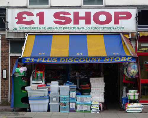
£1 Shop - Image by Emily Webber
Image by Emily Webber

London-based photographer Emily Webber has amassed a fascinating on-going portfolio of images of various shop fronts in London.

There is something so intriguing about these images, about the independent shops and businesses that are shown. So simple in concept, so layered under the surface. In a world which is dominated by big business and brands, the photographs seem to portray a dying world, a retro signed-existence that is too often forgotten or ignored. And like many urban photographical studies, it raises many questions about society. What does it tell us about our city life? What is the future for such a way of life? There’s chaos and grime, systematic of the city.

The collections are also a captivating look at various sign designs – graphics and typography, shop names from the random, to the ‘puntastic’, to the banal. From the american style to the classic italics. It’s like a life-size photoshop

font collection of the present and yet also the past.

Beautiful. Melancholic. Urban. Dying. And yet, somehow, very much alive.

Image by Emily Webber. The London Shop Fronts web site.

Post It History

In our seemingly digital driven modern world, it is often said paper is dead. Yet one paper product challenges this thinking: the humble Post It. A simple, yet distinctive design, the Post It is instantly recognisable and remains essential office/home stationery, as well as appearing in the art world amongst art works and installations.

In 1968 Spencer Silver, a scientist working at the adhesive 3M company laboratory, stumbled upon a glue that had such an unique pressure sensitive consistency, it was re-useable. It crucially also did not leave a residue. Silver saw the great possibilities in this accidental discovery, yet was unsuccessful in persuading 3M to persue its possible capabilities into an actual product.

Spencer Silver
Spencer Silver

Six years later, Art Fry, another scientist/product inventor at 3M, was attending church when he became increasingly frustrated at losing his place in his hymn books. His bookmarks were falling out of the pages. Suddenly, he had a divine intervention. What if the bookmarks were stuck to the page, with a light, re-useable adhesive that would not damage the page? He was already aware of Silver’s creation, but had suddenly envisioned the perfect niche to maximise its potential.

Art Fry
Art Fry

Together, Spencer Silver and Art Fry returned to 3M and developed the product. The Post It was finally launched in 1977. As soon as test samples were sent out, the Post It stuck to people’s consciousness. By 1980, Post Its were being sold across the USA, and by 1981, across the world.

The Post It is born
The Post It is born

There are now over 600 different post it products, illustrating their success and popularity. Practically every office or home has a Post It or two lurking on a desk or on a fridge door. They are perfect for jotting down things ‘to do’ or a telephone number, or a shopping list.

Yet I find the Post It is perfect for drawing ideas and drawings; quick sketches whilst I am waiting for the computer to load or for the kettle to boil. They are light and small to carry, their design making them perfectly portable, and the adhesive, of course, makes them wonderfully versatile. The Post It is ideal for doodling, a personal canvas that you can hang up on display anywhere, any time.

todo

In its short history, the sticky yellow label has gone a long way. A simple design, a huge effect. From a laboratory in Minnesota, via a church hymn book, to art galleries/offices/homes/internet videos across the world, the Post It proves paper media still has a special space in our lives. And if it falls off that space, it can quickly be re-attached.

Doodles by Sian

The Poppy: Design of Remembrance

Poppy

November is a month now associated with the Poppy, a symbol of remembrance and appreciation of the sacrifices made by past generations, and in the last few years, our own contemporaries. A classic and simple design, the Poppy as a logo is instantly recognisable, as well as a way people can display their own appreciation of this military sacrifice for our own freedoms. The Poppy Appeal has successfully used this flower as an effective iconic design of simple poignancy.

Amidst the carnage and devastation of the battlefields of the First World War, the poppy flower was seen growing amongst no man’s land, and carved such an impression on the mind of a serving doctor, John McCrae, he wrote the famous poem: “In Flanders’ fields, the poppies blow…”. This poem inspired an American War secretary, Moina Michael, to start selling poppies, the proceeds going to the ex-Service community. And thus the Poppy Appeal charity through the British Legion was born.

The first Poppy Day was in 1921, and has remained a tradition every November since. In 1922, Major George Howson, founder of the the Disabled Society (established to help disabled ex-Service men and women from the First World War), suggested to the Legion that members of the Disabled Society could make the artificial poppies sold for the charity. Subsequently, the original artificial poppy was designed so that disabled workers could manufacture it with ease, especially so that it could be made by a worker with only one hand.

The simple design was, therefore, mostly born from a necessity of easy assembly. As with a lot of great iconic logos, less is more. The blood red is striking, and yet the Poppy’s soft edges portray a powerful message of beauty amongst the destruction – of life amongst the dead. And lest we forget.